The seasonal colours we're loving at the moment

As we lead into Spring and the warmer months, we begin to consider new and exciting colour trends. This year, at CULTKĀ we’re falling in love with pastel hues and brighter bursts of colour, which have been backed by WGSN and Coloro, the trend forecasting professionals.
Let’s explore some of the forecasted results for the year ahead, that have incorporated a notable focus on health and wellbeing, discovery and calmness, and also provide our professional opinion on the colours we look forward to seeing more as the seasons change.
Shades of purple
A colour rarely found in nature, purple represents a sense of creativity and luxury. In more muted shades, like lilac and lavender, the colour evokes more of a sense of calmness and balance.
Digital Lavender has been considered the colour of the year according to WGSN and Coloro as we celebrate the fact life is returning to more normalcy after three years of the pandemic. This softened shade brings a sense of serenity and stability within a home.
See an example below of the TOGO sofa in purple.
Shades of red
Red is often seen as a colour of love, anger and danger. It’s also the colour that is most associated with demanding attention. According to the trend forecasting report by WGSN and Coloro, Luscious Red is the red of choice for 2022-2023.
A visually strong colour, red makes a statement in any space. You can see an example of the CAMALEON sofa below.
Shades of green
Copper based greens are also said to become increasingly popular in seasons to come. In particular, Verdigris green has been forecasted as a popular colour within homes and fashion.
Verdigris green translates to ‘green of Greece’ and with its inherent vivacity, this fungible hue is associated with renewal and rebirth. A heavenly colour for the TOGO sofa pictured below.
Shades of blue
Tranquil Blue is a subtle, pure blueberry blue with a wisteria undertone. It represents lightness and clarity, reminding us of the air and water elements.
This colour has been said to have calming qualities and can help counteract overwhelming feelings and emotions. Just as the inspirational BIBENDUM chair styling below.
Shades of yellow
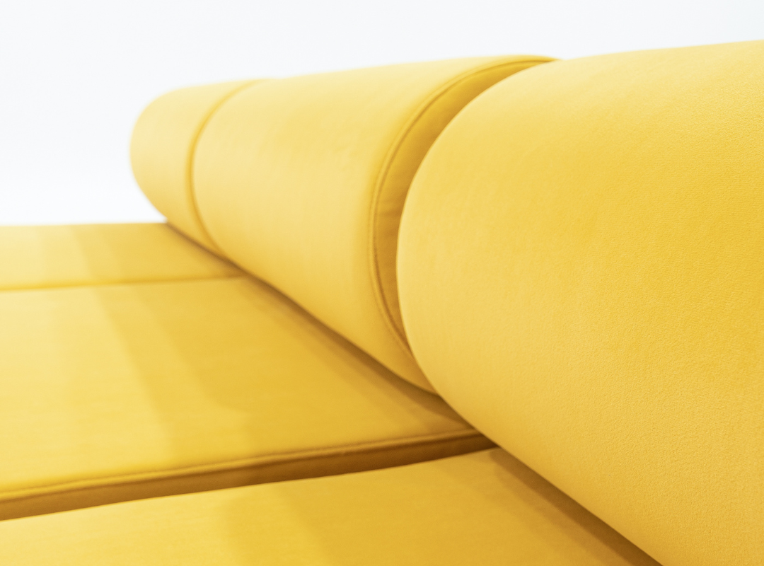
Yellows infuse light and energy into a space as they are warm and inviting. More burnt yellows like Sundial have become a nonnegotiable in the warmer months, to delight the senses and evoke a sense of happiness.
As you can see the CORBI sofa brings together this cheerful space.
Style your space with CULTKĀ
It’s no surprise that colour is making a comeback as we enter the warmer months. Depending on your desired outcome, explore our extensive range of in-season and timeless swatches and fabrics, free for you to order and try within your home.
Here are just some of our trending colours for Spring.
Explore all of our available swatches and fabrics.
Balancing your furniture with your environment is a fine art. If you’re considering revamping your space, or looking for advice from an interior design expert, we’re here to help. Book a time with our in-house interior designer team for expert advice on how to style your space with CULTKĀ.
If you liked this article, you might also like understanding the 3 principles of interior design.


